07.25.2022
Color Psychology In Marketing: Use Emotion to Sell
What’s your favorite color? You can usually deduct quite a bit about a person by their favorite color—and you can also deduct quite a bit about a brand by the colors they use. So what is color psychology? It’s the study and application of using colors to influence decision making, such as improving conversion rate on an e-commerce store. A lot of entrepreneurs don’t know that the various colors they use on their website can have a significant impact on the mood of their customers, so we’re here to help you learn what emotion each color evokes and which colors to use, (and which to avoid) in order to sell more.
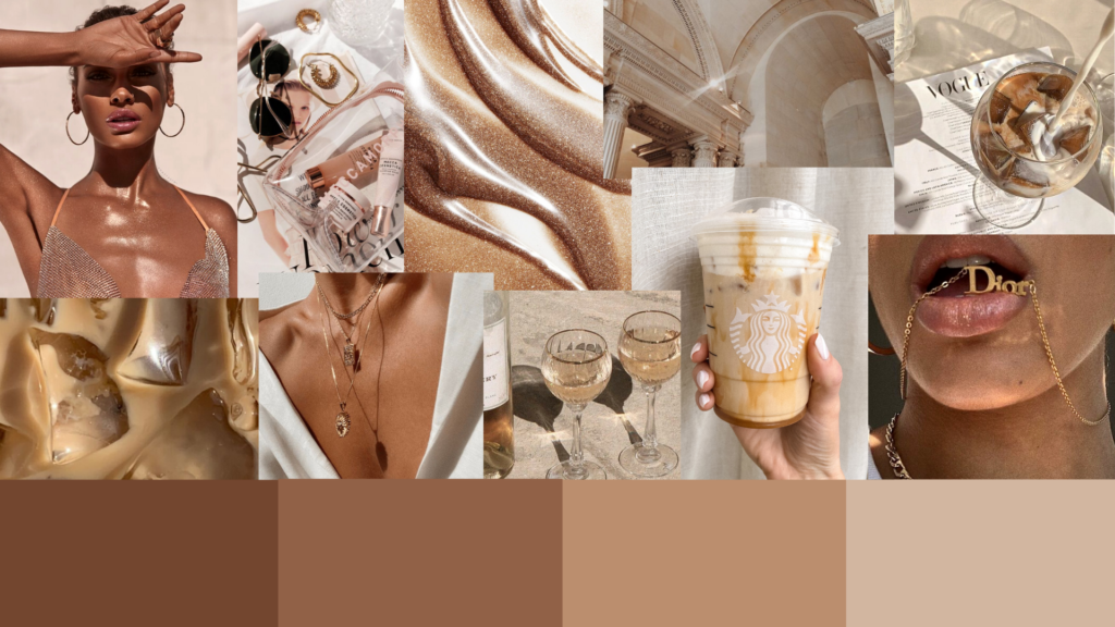
1. Brown
Brown is a strong and dependable color which is very reassuring to shoppers. It gives off an aura of confidence and, if used in the right amounts, can help convert a potential customer.

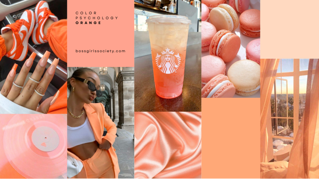
2. Orange
Orange radiates ambition and energetic warmth. It also represents passion, originality, and fresh beginnings. Orange paired with cool shades of blue can give off a positive and exciting vibe.

3. Yellow
Yellow is a cheerful and playful color that can really grab the customers’ attention. However, use it in moderation because an excessive use of yellow can turn customers off.
4. Green
Green has a natural and organic aura, and is considered to be very easy on the eye. When shoppers see green, they often relate the color to positivity, relaxation, safety, and harmony.
5. Pink
Even though pink is usually associated with femininity, it can appeal to males as well since it exudes kindheartedness, romance, and love. Pink has a soothing effect so it can be used to offset more aggressive colors like black, orange and red.
6. Red
Red taps into the deepest, most primal, emotions of shoppers. Since red is usually associated with love, life, and confidence, it can convert potential buyers into lifelong customers if used correctly. But beware, too much red on a webpage can be visually overwhelming.
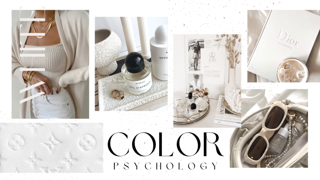
7. White
White exudes purity, wholesomeness, and clarity, and it is essential to most web pages. Most important, always include empty white space around your content so that customers don’t feel boxed in.

8. Purple
Purple has long been associated with royalty, power, and affluence. Intelligent use of this color can help the customer into making a positive purchase.
9. Blue
Blue conveys feelings of trust, peace, and productivity. Although blue is one of the most common colors on the web, it should be avoided if your webpage is involved with the hospitality industry, especially with restaurants as blue is said to decrease appetite.
10. Grey
Grey is usually connected with seriousness and a conservative mindset. The right shades of grey can serve as a great backdrop for other more vibrant colors such as orange, red, and royal blue.
11. Black
Black is associated with strength, power, and dominance. When used in ecommerce, it sends a confident message to potential customers. Excessive use can give off a bland and gloomy ambiance, so it should be used in moderation, along with other tranquil colors.
Need help finding your perfect color palette? Boss Girls Society can help you design a high converting custom website that reflects your product and industry!